How to choose your facebook ad formats
These days, you see all different kinds of Facebook ad formats. Big ones, small ones, loud ones and subtle ones.
They’re all over the place. But what if I told you that
- The choice to even use an ad,
- The right Facebook ad format for your campaign, and
- Which Facebook advertising approaches are the best for yoga businesses
…was a quick and easy decision?
This chapter will show you how.
If you want to see
- An overview of all the Facebook ad formats (called “placements”),
- What type of Facebook ad you should use, and
- Where, when, and how your ad will be seen by users
You’re in the right place.
(This post is Chapter 7 of Yoga Advertising on Facebook: The Ultimate Guide. See a full table of contents here, and for a PDF copy of this entire guide, click the button below.)
What the heck are placements?
Placements are where your ad shows on Facebook or Instagram – and there are a lot of them.
It kinda reminds me of every time I go out to a mexican restaurant.
Riddled with decision fatigue after a long day, I pass a wall of vibrant sombreros, sit at a table, and open the menu – only to encounter this:
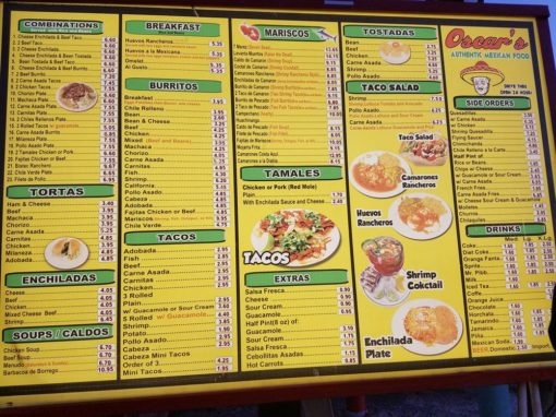
Choices. A million, billion choices.
When there are loads of options, and I’m not really sure what I want, I’m paralyzed.
It’s a similar experience in the Facebook Ad Manager when it’s time to choose placements – and I know I’m not alone.
Placements are where your ads show – a tupperware container for your creative (your video/image/audio/copy). Some containers are image or video-only, while other images allow for some text, and others still allow for lots of text.
It’s no wonder we’re confused, though – look at this menu!
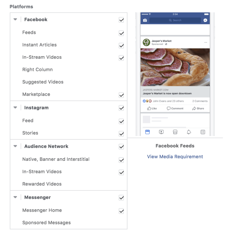
“I wonder what that is… let’s spend my money on it and find out!” might work for a margarita-fueled meal, but it’s not a good look when you’re planning out your Facebook and Instagram ads.
Think about it – you spend all this time making a video or image (or hiring a designer), slave over writing the perfect copy, and then publish your ad, only to see disastrous results.
Having the right videos or words in the wrong locations just makes you look like an amateur. You have to “make the creative native.”
“Make the creative native”
Gary Vaynerchuk’s book Jab, Jab, Jab, Right Hook effectively showed us that, when brands ace the platform, they come off as savvy.
There’s a challenge, though: Facebook has gotten so big that there are many different ad formats and locations.
Maybe your placements are the problem.
=
Why do we give up when we get to the placements? I think it’s because we’ve already made several important decisions in the Ad Set step.
The ad set is where you set your whole budget – that in itself is a whole can of worms.
It’s also where you choose your audience, the strategy and techniques of which could really be an entire freaking book.
And you know that after checking these boxes, you get to move on the actual ad creation, which is the funnest part, so you’re ready to get this behind-the-scenes stuff over with.
On top of that, there’s a deliciously tempting button that looks like this:

Oh hai Facebook – really? You’ll take this off my hands? Thank you so much!
(This is where many of us get tripped up, btw.)
By the time you get to the placements section, it’s easy to say “F this, I’m done,” and just go on with your life.
(Like I do with every mexican menu – pretty sure I’ve ordered Chicken fajitas the last 336 times I’ve gone out for Mexican food because of decision fatigue.)
You want to know where your ads show, what they look like, and how they do, so you can repeat that success in the future.
So in this blog, I’ll break down what each of the placements in the dreaded “placements” section looks like – and the best strategies that apply for each.
Facebook ad placements: an overview
You select placements in the ad set. When you come to this option, you have the choice of selecting automatic placements or edit placements.
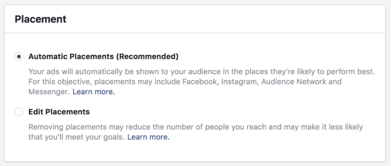
If you select Automatic Placements, Facebook will place your ad for you in various locations to try and figure out the best spot it will perform.
I’m iffy on this, because if you’ve created the wrong images, videos, or text for a placement, you come off as tone-deaf and the ad hurts your brand.
Instead, make your creative native.
Always have your creative be specific to that platform. For that reason, I suggest you choose to edit placements for your ad, and test different placements as different ad sets.
When you choose “Edit placements,” you have the option to specify Desktop or Mobile. In most cases, All Devices will get you the most exposure, but it’s good to know your options.
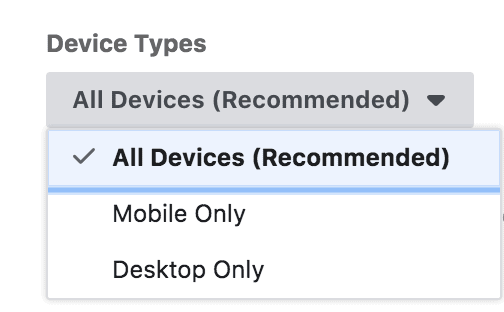
Then you have the placements themselves – and there are a lot. Luckily, they’re very similar, and since Facebook has added a visual when you hover over each to see what it looks like, you have a better understanding of what you’re buying.

Let’s dive into each placement’s strategy in list format.
Facebook placements
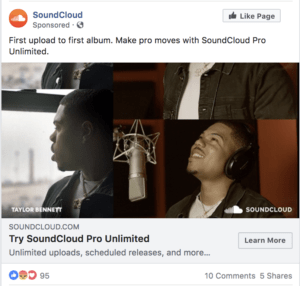
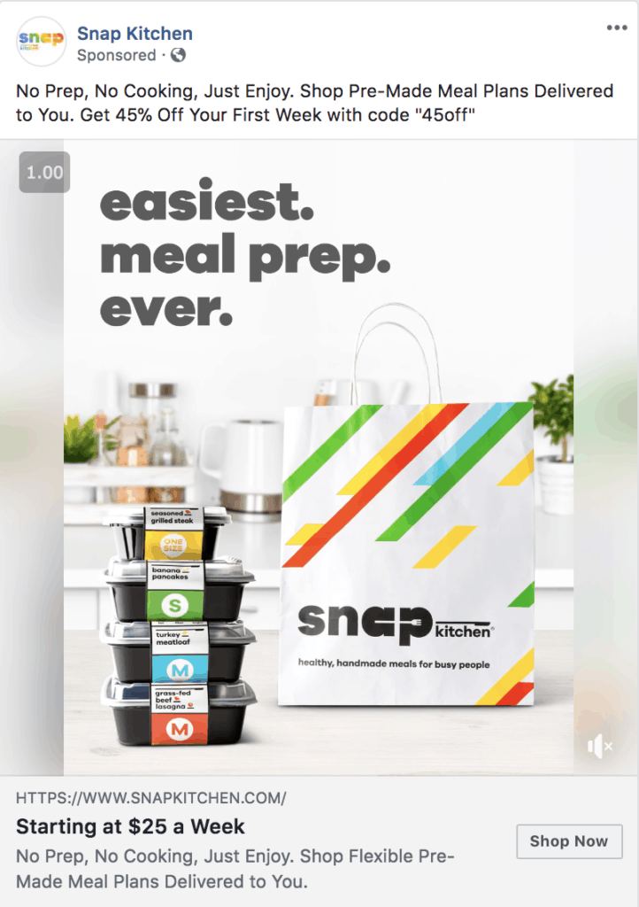
This one is probably obvious. News feed.
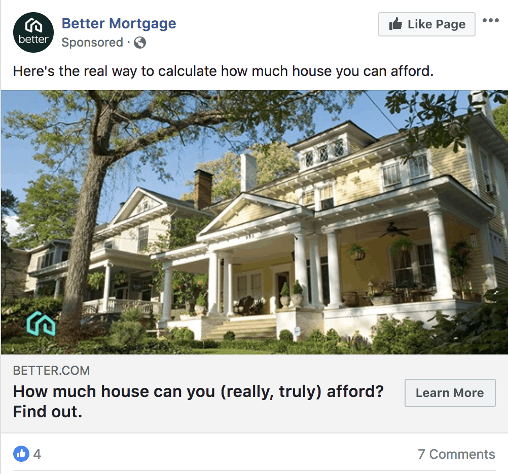
The news feed is the area we’ve seen Facebook ads the longest. Since there are a lot of advertisers bidding for this space, your dollar won’t stretch as far in terms of reach.
What you DO get, though, is flexibility. You can upload a photo or video (or do no photo/video at all if you dare), have a status with text, and also have a headline below your creative with a short description.
Instant Articles
Ever try to click through to a blog or article on your phone, only to have it take FOREVER to load?
Instant Articles is a platform designed by Facebook, for Facebook, that loads news articles and related content for you much faster than web browsing.
(SInce Facebook created this, it also means they slip in some ads here and there).
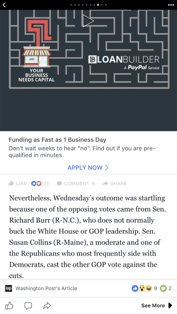
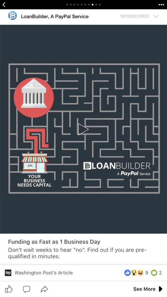
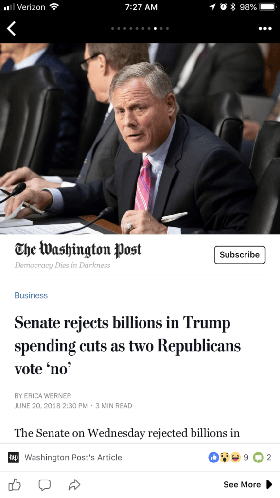
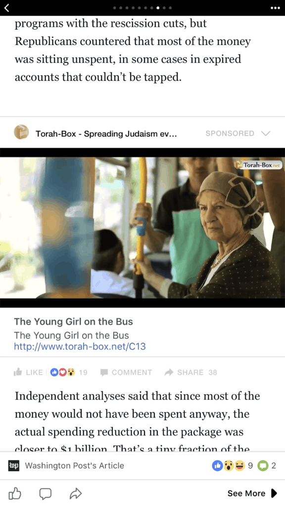
Here’s an example of an article from the Washington Post that I browsed on my phone. The article had three ads peppered in throughout.
If you look closely, you see like/comment/share buttons at the bottom, as well as a
“See More” button, which takes me to other Washington Post articles. I technically never left Facebook.
Facebook says “Rather than loading an article using a web browser, which takes over 8 seconds on average, Instant Articles load using the same fast tools we use to load photos and videos in the Facebook app, allowing articles to load as much as 10 times faster than standard mobile web articles.”
Since Instant Articles ads are NOT posts, your ad copy should be way, wayyyyyy shorter on these ads. Otherwise, you’re just cutting yourself off.
Again, “make the creative native”!
In-Stream videos
Popular videos and longer videos on the Facebook news feed will have occasional “commercials”. These are Facebook ads! They must be 15 seconds in length and are just a video.
Facebook recently added an option to put an image in this placement, in which your image would show for 15 seconds.
One thing we’ve noticed about these in-stream videos is that people WATCH – video completion watch percentages are sky-high on this placement.
This is probably because viewers and video-watchers already have momentum from what they’re watching, and they want to continue watching what they’re watching.
In this screenshot, check out the difference in results when we used the SAME video in the In-Stream Video placements (the first two results) versus the Facebook News Feed and Instant Articles placement.

In a world of endless phone scrolling and fractured attention, 15 seconds is a gargantuan amount of time to have someone’s attention, which makes this placement valuable and inexpensive.
Right Column –
On the desktop, there are a couple of boxes where small ads show. This is a nice spot for reminder ads to a warm audience.
There isn’t much room for text or to explain anything, and it’s image-only, so your best bet is to use this placement to remind users about you when they’ve already heard of you or when you’re in a sales window.
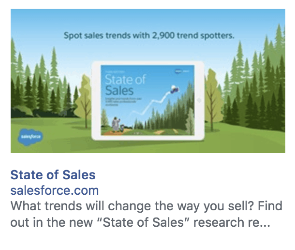
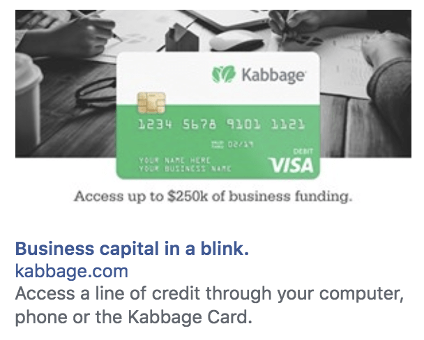
In this example, Salesforce’s copy gets cut off, while Kabbage Card’s shorter copy fits in the page.
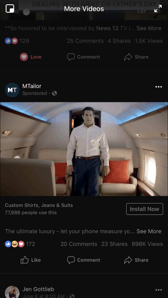
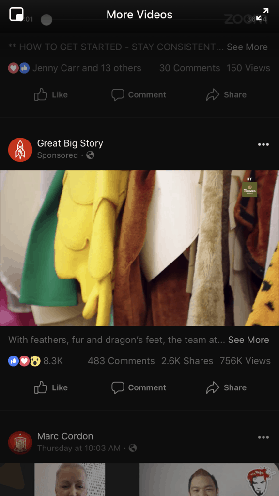
Suggested Videos & Marketplace
When people go full-screen with watching videos on Facebook, Facebook queues up a list of “suggested videos” automatically. Your ad will be shuffled in here.
Marketplace works similarly, except that the queue is of products that users can shop, rather than suggested videos.
As a fairly new placement, I would think of this placement as similar to an Instant Articles Placement. Copy can be short.
Instagram placements
Reminder: Instagram, as a whole, is far FAR more visual than Facebook. More imagery and far less text is the way to go.
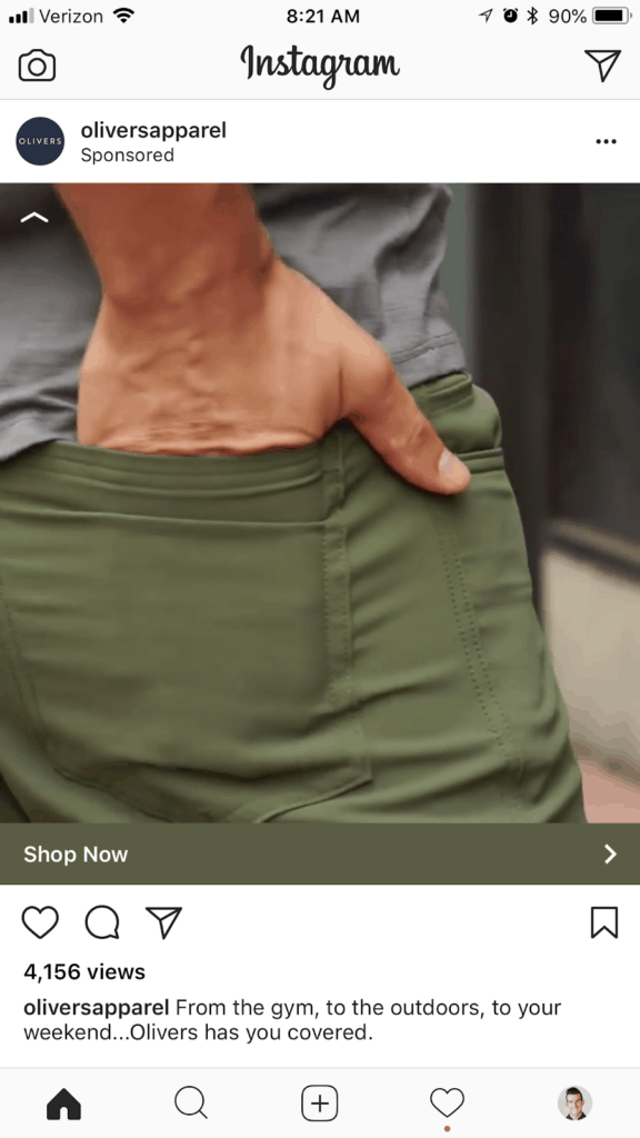
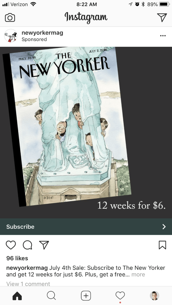
Feed – This refers to your news feed. I personally do the Instagram feed placement as a separate ad, because there is much less space for text, so I have to get to the point right away.
Videos in instagram feed placements must be under 60 seconds in length. Also consider doing a square video or square image when you can – not only does your creative take up more of the screen, but it also feels more native to the instagram platform. Instagram loves squares.
Instagram Stories
It’s no secret that Instagram Stories are becoming increasingly popular. Some assert that stories may eventually replace the news feed altogether in terms of how we communicate.
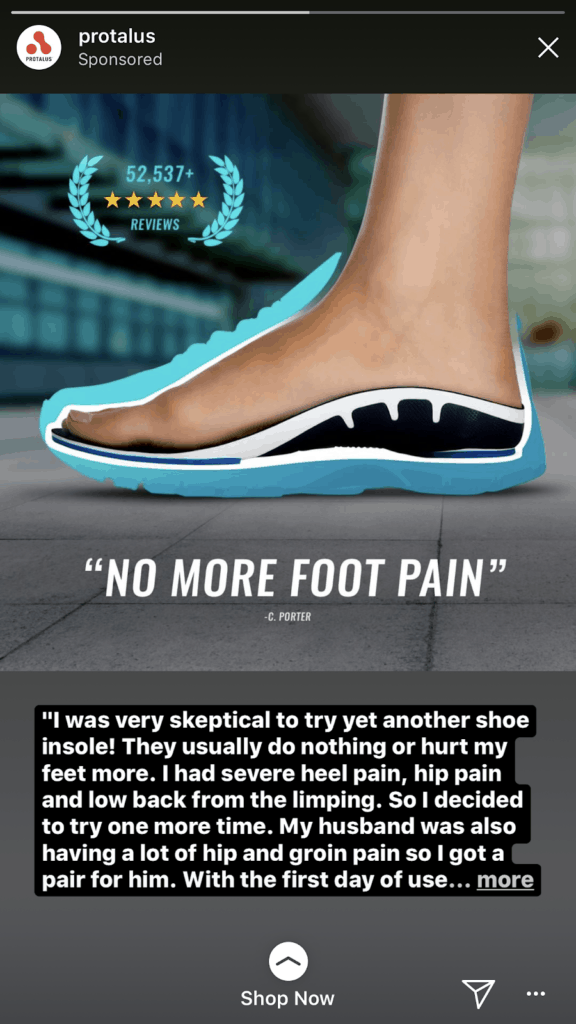
This is probably one of the most valuable placements these days, because not a lot of people are using Stories ads, so your dollar stretches wayyyyy further.
A stories ad allows for just 15 seconds of content. You can do this with video or with a series of images. Either way, similar to the in-stream video placement, you can’t dilly-dally here.
Your content will need to be correctly-sized vertical video (1080 pixels wide by 1920 pixels tall, with is a 9:16 ratio) for these to be most effective. You can also post a square video and a status, and Instagram will turn your creative into the image on the right.
Remember, “make the creative native”. I don’t like the ad on the right because you couldn’t read more text even if you wanted to.
You want your ad to feel like a story – I like to try to play the game that my ad fits in to the platform so well, people don’t even realize it’s a sponsored post.
Audience Network placements
Audience Network is a network of other pages and businesses that have partnerships with Facebook.
This helps Facebook have more places to show your ad, and since this technology is newer there is less competition, so your ads are cheaper to show here.
For local businesses, I don’t love this platform – it’s harder to assert your message powerfully. But if you’re getting in front of people who already know you during a launch, promotion, or sale window, these ad placements can stretch your dollar very far.
Native, Banner, and Interstitial
Here is an illustration from Facebook of what each of these ads look like in the audience network:
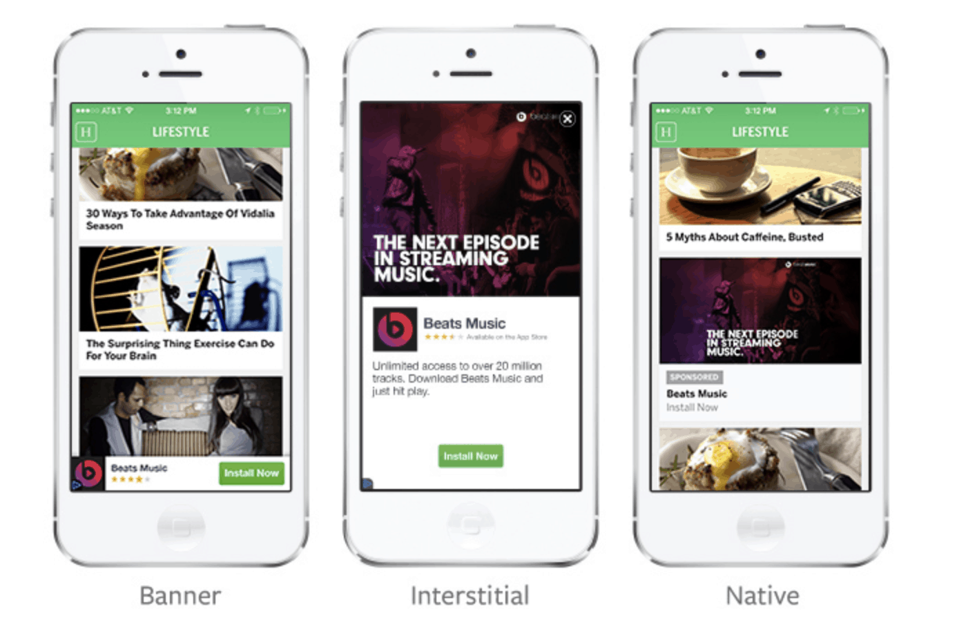
The ad is for “Beats Music” in all three of these. (Source: Facebook)
These ads will resize whatever videos or photos you decide to use, so you don’t need to resize anything specific to banner or native placements.
I suggest you plan this ad placement for the Interstitial ad placement shown above – this way you will have copy in the post.
In-Stream Videos
Like with feeds, in-stream videos interrupt a video on the Audience Network.
Think “commercial” and take the same approach that you would take for the In-Stream Video placement explained above.
Rewarded Videos
Ever play a game on an app, and be told you’ll get 100 bonus coins if you watch a video ad all the way through? These are the Rewarded Videos placement.
Ads that encourage app installs do well in this placement. Similar to in-stream videos, short videos also do well here, because consumers want to keep doing what they were doing, so they’ll watch your ad all the way through to get back to their app or game.
Messenger placements
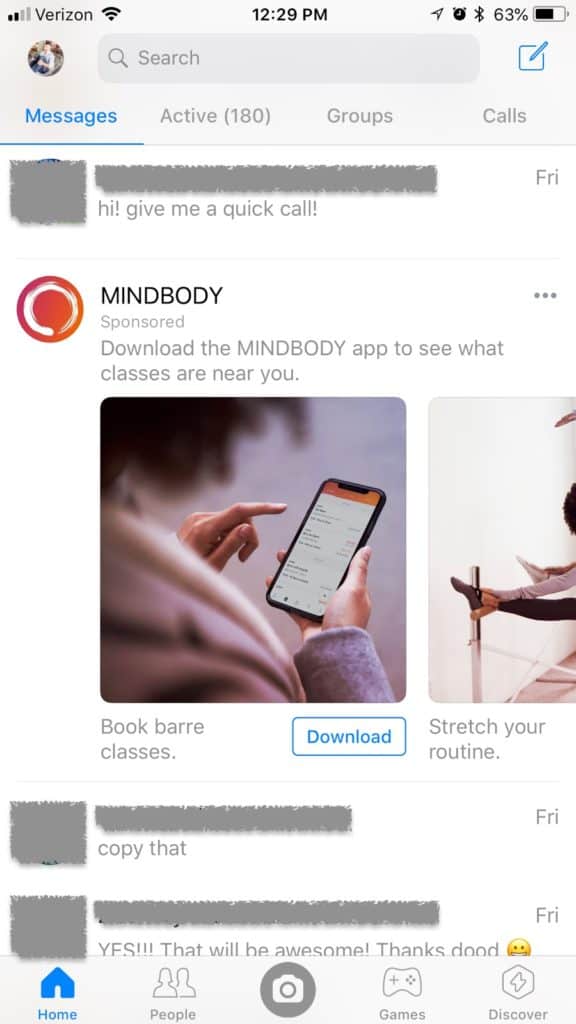
These ads are not a message, and show up in between messenger messages. In this example, MINDBODY is the Messenger ad, featuring a photo carousel.
The image or video is smaller, the text is shorter, and running an ad that drops smack dab into someone’s Messenger inbox can feel interruptive, so you will want to be charming and clear.
I like to approach this placement similar to the “Right Column” placement, and use this real estate more to “remind” people that the doors are open during a launch, promotion, or sale.
The “Sponsored” placement is another option, but is tricky, because you can only target people who have already messaged your business page.
For most of us, that’s barely anyone. If you actually have that much traffic and clientele contacting you through Messenger, I would use ManyChat instead.
ManyChat is for Messenger bots, but you could also use it just to create a list of people who reach out to your business on Messenger, and then broadcast an announcement to this list at a later date (that method would be free).
Your best strategy
As with everything else in the ads world, There is no one magical approach that will give you perfect results.
If you’re fairly new to ads or just getting started, test some of the more approachable options (and ones that you probably interact with anyway on a day-to-day basis). I suggest starting with these four:
- Facebook News Feed
- Facebook Instant Articles
- Suggested Videos
- Instagram Feed
If you’re comfortable with using 15-second videos, you could explore the In-stream video and Instagram stories placements options as well.
Now we get to the best part of creating ads – the ad itself! Check out Chapter 8, the next chapter, which is right here.

